Showing posts with label UX. Show all posts

Sunday, 13 July 2014

UX: Death to Versioning! (aka. the Perpetual BETA program)

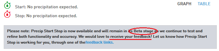
(from http://www.theweathernetwork.com/forecasts/precipitation/canada/ontario/toronto)


The other day I was viewing weather updates on www.theweathernetwork.com when I ran into a new feature "Percip Start Stop" for tracking rain by the hour. What surprised me was not the new feature but the above disclaimer. BETA stage. Soliciting User Feeback.

As a long-time gmail.com user (back when you had to get a invite just to get an account!) I'm used to being the QA department for companies. Google is known for being in "perpetual" BETA, as this Wharton K@W article: "Is Google Stuck in ‘Perpetual Beta’?" outlines. Ever try to figure out the exact "version" of gmail you're using?

However controlled BETAs help facilitate rapid deployment of new features. It's often a low-risk, high gain way of not waiting for a major release to see if there are new features users like and will use. For UXers this is a chance to update small changes without having to wait for major release (but I don't suggest changing the UX too radically too regularly... that's a good way to annoy users). 

"Back in the day" we used to wait patiently for new version, like Windows 3.1, 95, 98, XP, Vista, Windows 7, Windows 8, etc, we expected to have to pay more for the newest release to get new features. Many users didn't upgrade and that's why we now have the Windows XP EOL issue as outlined in this Microsoft support article: "Windows XP support has ended". Yet I think he Web and Mobile revolutions have changed radically for the following reasons:

#1 -  On a website you can generally *only* have access to the latest version. A website generally has usually one version and this makes it easier to maintain. There is no install for a website, so changes are implicit and virtually immediate. When it's it's UP it's OUT! Very different from former native apps which changes only occurred when users installed an update.
(For the record I think Gmail does usually have a linked to revert to the old theme or UI, at least for a little while.)
#2 - Users are always running latest version. Generally speaking users who buy mobile apps from AppStore/Google Play Store have free upgrades and do in fact upgrade often. Pretty much when the new iOS update is out within days everyone is upgrading.
(After Heartbleed Bug and other vulnerabilities it seems like some apps update every few weeks now. I always get these notifications on my iPhone.)
 #3 - Users culturally embrace change. For the most part users are very open to changing UI. Therefore, because there generally isn't a uproar or backlash, this has given license for companies to regularly re-vamp their apps and websites, almost as often then as they re-org.

(UX Warning: However I've encountered issues with older users who spent years learning how to to use Hotmail.com, only to have one day all the button changed on them and not know how to use the site anymore.)
 #4 -Cloud SaaS and pay-per-use. Since companies like SalesForce.com have turned software into a lot like leasing cars. If you don't care to own it then were happy to give you the latest and greatest car every few years (or in internet years, every few months).
 #5 - Rapid pace of change. It's likely cliche, but really the pace of change is so quick that without a steady pace of updates many of our websites and apps would be obsolete. Every so often I read a UX book with a screen capture of a website from 5-10 years ago and laugh how outdated the IxD is.
The only unfortunate part I see in perpetual BETA program is that sometimes I feel companies use this as license to release lesser tested software. In a true BETA I should be providing feedback on my experience, not submitting bug reports. +_+

(In full disclosure, I work for SAP and we have a very strict release process and I don't think it's changing any time soon. For the curious, it's called I2M (Idea-to-Market) and PDF executive summary is available online: Product Quality at SAP.)

However even SAP is quickly becoming a cloud company (see SAP buying SuccessFactors for 3.4 Billion back in Dec 2012). When you move to SaaS/on-line/Cloud offering, you are basically no longer owning the maintenance and upgrade of the platform. So when we upgrade the Cloud, we're doing it for everyone, and this allows us to roll-out these BETAs and hopefully provide things even quicker than ever!

Hope that helps...

Wayne Pau

p.s. For more jokes about Gmail spending so long in BETA you can read this blog: "Gmail leaves beta, launches "Back to Beta" Labs feature" in which Google actually added a way to put back the BETA disclaimer. ;) Jokes.


(from http://gmailblog.blogspot.ca/2009/07/gmail-leaves-beta-launches-back-to-beta.html)

Sadly when I tried it on my gmail today I couldn't find the setting. I guess that joke got old quickly. Likely when they started to charge companies for an "enterprise" version.

It also does not escape me that ironically I'm blogging this on Blogger/Blogspot, which is also another Google product. :)

Wednesday, 12 February 2014

UX: Don't Make Me Think Revisited (aka 3rd Edition)


When I came into the office in January I realized that Santa (aka Steve Krug) via Amazon had left me a belated X-mas gift via mail!


If you are in UX and haven't read this book (in any edition), I can't over emphasize how important this book is. Steve is great at making complex things seem "common sense" and his super reasonable, laid back, humourous approach can warm even the grumpiest usability Grinch.


The "revisited" (or "reloaded" for Matrix fans..) part also includes a whole new chapter on Mobility (Chapter 10, titled "Mobile: it's not just a city in Alabama anymore"). Really this chapter will take you 20 minutes to read but it could change your life, I mean app. It might be worth it to just to buy the book only to read this new chapter! It's 21 pages of very, very relevant material for anyone doing mobile development.

For something more "fun", have a look @ Steve's Blog on how he played with the covers before settling on the current design.


(http://someslightlyirregular.com/category/usability/)

=) Then... for even more fun do a quick search in Amazon of the book to see what other covers exists! It took me a bit to identify the 1st edition cover being so vastly different from 2nd edition, but I did find one in German with a neat look (Das intuitive Web!). So from 1st to 2nd edition, not much changed, but Steve and the published definitely made some whole-sale changes for 3rd edition. I personally think it looks great.


(Amazon Web Search URL)

With a gun pointed at my head, (ignoring that I consider Steve a friend) and told I could only get my team-mates and stakeholders to read just one book, this would be that book. It totally puts UX concepts into things the "everyday" person can understand. The examples (updated in 3rd edition) are incredible helpful and the humour makes it easy to get though the book in single day or sitting (although you might want to spread it out to let it sink it more or just constantly keep using as a reference).

Hope that helps...

Wayne Pau


p.s. In full disclosure, I admire Steve's knowledge and expertise in usability and even more importantly I really like him as a human being. He was generous enough to add me to acknowledgements page (yes I'm that Wayne Pau) but really my contributions and insights (if any) in the Mobility Section (Chapter 10) were very tiny. He's just that nice of guy! Thanks Steve...


Monday, 16 September 2013

UX: Silly Error Messages (Is this Violent & Destructive, ending in Utter Failure?)

This is a quick post. Today, as I was doing some UX work, I got this error in Windows 8:


It was while trying to over-write an image (PNG) with a newer one. 

Two quick reactions:


  1. I would hate to be translator @ Microsoft who had to translate this into other languages. How bad is it really? Catastrophic, that must be really really really bad. Better get out my thesaurus so I get the 'tone' just right...
  2. As a end-user, I was trying to understand what to do next? I tried it again, got the same error. Then I was thinking, do I need to restart my laptop? So do I prepare for a upcoming crash? Should sell my stocks and prepare for the end of the world?


This is what Webster's dictionary says about the word:
1 :  the final event of the dramatic action especially of a tragedy
2 :  a momentous tragic event ranging from extreme misfortune to utter overthrow or ruin
3a :  a violent and sudden change in a feature of the earth
3b :  a violent usually destructive natural event (as a supernova)
4 :  utter failure :  fiasco <the party was a catastrophe>
So basically my Folder view is like a:

  1. A tragedy...
  2. A 'violent' and 'destructive' end...
  3. An "Utter" failure...

On top of THAT... my only recourse or option is..

"press OK to continue"

Like everything is going to be OK after this Catastrophic event. 

No 'cancel'. No revert. No retry. No where to get additional help or error codes. No support logs. Nothing... 

...Go about my normal business. Move along. Nothing to see here... 

The 'error message' does not match the 'response'. It doesn't seem like an appropriate response. As an end-user (with my Design Thinking/Empathy hat on...) this would irk me. It's like it got me worked up for nothing!


But at last, thanks Microsoft! You made my day. =) Or at least you put a smile on my face... (To be fair, Microsoft isn't the only software vendor to have error messages like this. We all do it... we should just all do it less often...)

Bottom line: I'm going to think twice when I write my next error massage. That's for sure...


Hope that helps...

Wayne Pau

Wednesday, 3 July 2013

UX Terminlogy: Rams' 10 Commandments of Good Design

(From https://www.vitsoe.com/us/about/good-design)


Have you heard of Dieter Rams? If you haven't, just remember that Apple's main design guy, Apple's Jonathan Ive is often quoted as saying Rams was one of his major influences.


The man behind that is Briton Jonathan Ive, officially the senior vice president of industrial design at Apple, and he has long acknowledged Dieter Rams as his inspiration.
(http://www.telegraph.co.uk/technology/apple/8555503/Dieter-Rams-Apple-has-achieved-something-I-never-did.html
Dieter Rams was an incredible designer that left a large design legacy through his work at Braun (many of his works are on permanent display @ MoMA). What is amazing is that looking back at his life's work the wide range of products he designed for, anything from record players (ie. his famous Snow White's Coffin) to hair dryers to juicers to watches/clocks. You can get a glimpse of the list of products he's produced here at the Less and More exhibit YouTube Clip.

In his interview here he credits one of his influences his grandfather, a master carpenter who was a specialist with surfaces.  Even Jonathan Ive mentions how big surfaces were in regards to Rams' designs:

“surfaces that were without apology, bold, pure, perfectly-proportioned, coherent and effortless”
(http://www.telegraph.co.uk/technology/apple/8555503/Dieter-Rams-Apple-has-achieved-something-I-never-did.html)  
This made me realize that as a designer, we're actually a amalgamation of our history, upbringing and skills. Much like Steve Job's Calligraphy class, this reminds of the quote from Lord Alfred Tennyson's Ulysses:
"I am part of all that I have met;"
Designers are not simply a trade that is learnt and applied in a vacuum. Good designers are multi-disciplined people. (@SAP, our own CTO Vishal Sikka loves reminding us that we need to be "T"-shaped to excel.)

Yet aside from all his designs, what will likely live on even longer than Ram's designs are his "10 commandments" of design. Ultimately 'great ideas' outlast 'great products'.


1. Good Design Is Innovative— The possibilities for innovation are not, by any means, exhausted. Technological development is always offering new opportunities for innovative design. But innovative design always develops in tandem with innovative technology, and can never be an end in itself.

2. Good Design Makes a Product Useful—A product is bought to be used. It has to satisfy certain criteria, not only functional but also psychological and aesthetic. Good design emphasizes the usefulness of a product while disregarding anything that could possibly detract from it.

3. Good Design Is Aesthetic—The aesthetic quality of a product is integral to its usefulness because products are used every day and have an effect on people and their well-being. Only well-executed objects can be beautiful.

4. Good Design Makes A Product Understandable—It clarifies the product's structure. Better still, it can make the product clearly express its function by making use of the user's intuition. At best, it is self-explanatory.

5. Good Design Is Unobtrusive— Products fulfilling a purpose are like tools. They are neither decorative objects nor works of art. Their design should therefore be both neutral and restrained, to leave room for the user's self-expression.

6. Good Design Is Honest— It does not make a product more innovative, powerful or valuable than it really is. It does not attempt to manipulate the consumer with promises that cannot be kept

7. Good Design Is Long-lasting— It avoids being fashionable and therefore never appears antiquated. Unlike fashionable design, it lasts many years – even in today's throwaway society.

8. Good Design Is Thorough Down to the Last Detail—Nothing must be arbitrary or left to chance. Care and accuracy in the design process show respect towards the consumer.

9. Good Design Is Environmentally Friendly— Design makes an important contribution to the preservation of the environment. It conserves resources and minimises physical and visual pollution throughout the lifecycle of the product.

10. Good Design Is as Little Design as Possible—Less, but better – because it concentrates on the essential aspects, and the products are not burdened with non-essentials. Back to purity, back to simplicity.

The VitsÅ“ company which Rams joined after Braun states that he came up with the list after growing concerned about the designs around him. 


Back in the early 1980s, Dieter Rams was becoming increasingly concerned by the state of the world around him – “an impenetrable confusion of forms, colors and noises.” Aware that he was a significant contributor to that world, he asked himself an important question: is my design good design?
As good design cannot be measured in a finite way he set about expressing the ten most important principles for what he considered was good design. (Sometimes they are referred as the ‘Ten commandments’.)
(https://www.vitsoe.com/us/about/good-design)


His list was created 30 years ago and they are as true today as they were then. One could argue that companies like Apple are using his very principles to dominant in their respective markets. I'm sure all of our own products could be greatly improved if we adhere to his 10x principles.

All the ideas are great. However the following points really strike a cord with me:
#4 - Understandable is what I believe is driving a resurgence in UX. The best products that just 'make-sense' and don't require me reading a long manual.
#8 - Thorough is something I believe in strongly. I like being detailed orientated when possible. I agree with Rams that even the smallest detail is well designed, I know I'm in for a special product.
#10 - Simplicity is something that also really resounds with me. As a designer simplicity is definitely one of the toughest tasks of any good design.

A good visual version of this list also exists here.

Hope that helps...

Wayne Pau.

Saturday, 15 June 2013

Pop Question: Do I need a different Phone *and* Tablet app? (Zebras vs. Horses)

I have to say, I get this (and a related) question quite often. It makes a lot of sense from a technical point of view, since 2x different apps means twice as much work, 2x different entries in Google Play Store/Apple iTunes/BB World, etc.


(Pair of Zebras @ Toronto Zoo)


Have you ever asked yourself what differentiates a  Zebra vs. Horse? They are both part of the Family "Equus" and some sources say the name the word "Zebra" comes from Portuguese meaning "Wild Horse" or "Wild Donkey". However, as much as a Zebra looks likes 'White' Horse with 'Black' stripes, turns out they are physiologically quite different. Zebras are said to be very hard to tame, have solid (aka "meaty") tails and ultimately Zebras are only native to Africa continent. For more info see here and here.

So for your apps, you need to take a look at how different it *would* or *could* run on Tablet vs. Phone. Can a single code-base run with enough detection/adaptation code to adjust properly on both formats? Would future enhancements or changes to one platform but not the other cause issues?

For example, look at my friends at NitroDesk, who offer a 'popular' (to the tune of 2 million users) very "security-focused" 3rd-party Email-App Vendor. Their Android offerings have both a Phone (aka "smartphone") and  Tablet (aka "HD") version.


TouchDown email for Android SuperPhones
 The Phone version is mostly optimized to the typical "Portrait" view with ListView control. In contrast the Tablet version is optmized to the typical "Landscape" view with multiple panel approach. It's not *just* the the size of the screen that is optimized, it's the user & interaction.

TouchDown email for Android Tablet

For us @ SAP, for the current mobile app I am working the answer was 'NO'. So the group I am working with has chosen to create separate a Tablet and Phone optimized with different IxD. (Note: The plan is actually for eventually 4x releases, iPad, iPhone, Android Superphone & Android Tablet.) 

Yes you can 'code' some of the logic into the app to auto-detect the screen size, density and layout, but especially for Android with the "Fragmentation" (not to be confused with a code android.app.fragment... I will have a posting on this topic soon...keep an eye out for it...), I don't believe this is going to be always 100% reliable. 

My current advice is to design and offer 2x different apps and guide the end-user to pick the optimal version. Ultimately I'd rather have 2x great apps posted vs. 1x mediocre one. 

Bottom Line: 

A Zebra is in fact not just a White Horse with Black stripes. 

Just like a Tablet is not just a bigger Phone, and therefore we shouldn't treat it as such.

Hope that helps...

Wayne Pau.

p.s. Yes, the opposite is also true. Can you "pigeon hole" users with 2x different apps? With both a Tablet and Phone optimized apps, what about Phablet users? My suggestion is to make Tablet and Phone optimized apps, but not restrict them via the app store (ie. Android Manifest file, etc). This way for users of a device that is a hybrid they can test out *both* apps and find which works best for them.


Wednesday, 12 June 2013

UX Term of the Day: "Hamburger" (#4 Hot UX Trend for 2013...)

*Ahem*...

'Hamburger' meet World. World meet 'Hamburger'...


A hamburger button or control is basically 3x horizontal lines of equal length that review a side navigation panel. The going 'theory' is that it's called Hamburger because the top and bottom lines are the 'buns' and the middle line is the 'meat' or burger patty.


Visually its identical to the menu button beside address bar on Chrome Browser (for those 52% of viewers who use Chrome to view my blog!).

Don't believe it's a new trend? Gizmodo has as #4 new UX trend for 2013. See here.

This newest little UX pattern is on the latest LinkedIn and Facebook app released just earlier this year. Jessica Lessin from 'WALL STREET JOURNAL' even did a feature article on "Hamburger Button" in March (2013) with a short video demonstration of the control on the WSJ app:


*IF* you are planning on using a Hamburger in your app, I have a few suggestions because this control is implemented so many different ways:

  • When it's used just as a menu control in a top nav bar, it often acts like 'Butcon' (Button Icon) which you 'Tap'.
  • When using as a sliding menu, it is a 'Tap-and-Drag' control
  • However I also like the 'Bezel Swipe' gesture to also open *and* hide a menu control. (This last one is used quite often on BB10 and Win8 Surface to activate standard device menus.)

Therefore you would need at least these 3x ways:

  1. 'Tapable'  Menu butcon with visual feedback for depressed state
  2. 'Tap and Drag' control, so user can "drag" open the menu
  3. 'Bezel Swipe' gesture from the left side of screen (along *all* of the left-hand-side).

Well, there you have it. 

If the trend stays the same, we're likely to see this control on just about everything, just like we saw the explosion for "Pull-to-Refresh". (Interestingly, for those of you who didn't see it, I think Twitter and Loren Britcher got it patented... but agreed to "only use his patent defensively"...)

Baring any radical changed, you should start to see the Hamburger on at least one Mobile SAP app that I have pushed for on at least two different platforms. SAP isn't a radical IxD shop, so when we're adopting it, it's "definitely" gone mainstream! ;)


Hope that helps...

Wayne Pau.


p.s. Er...so that Hamburger control, it just three lines right? Well.. make you don't get it mixed up with the following somewhat 'similar' controls:


1. Motorola Hardware Menu Button
2. MS Word Bullet Butcon
3. Android Holo Composition Icon
4. Android Context Action Bar Overflow (top right on Android devices)

To be honest there are a of other very similar ones too, I could have easily expanded the list. It just goes to show you, it's all in the 'subtle' details, right?

p.p.s.Still don't believe me? Well here are two screen shots from the recent Facebook and Flickr apps.
(Facebook @ Android)

(Flickr @ Android)


Thursday, 6 June 2013

UX Term of the Day: "Fitt's Law" (aka Fat Fingers...)


Ever have one of those controls on a screen that was Soooooooo small you couldn't tap it twice in a row if your life depended on it? These are the apps that make me pull out my pinky-finger in order to try to tap something... (If I'm totally honest with myself, pretty much every mobile phone soft-keyboard feels like this at times...there just *never* seems to be enough space to fit in all those keys!)

Earlier this year I was helping test an application for BB10 that clearly had some usability struggles. One of the issues that really stuck out was that one UI controls was about 4mm in width. That's actually about 1/2 what size it should have been.

So how big is big and how big is big enough? Turns it's not arbitrary and we have some math & science that basically tells how big something should be. The formula often used is called Fitts' Law:


Fitts' Law Formula

I've *simplified* here, but Difficulty (or technically the ID - Index of Difficulty) is logarithmically proportional to Distance Moved or how far the user has to move (the cursor or their "finger") and the Width of Button or the size of the 'tappable area' of the UI control. 

When we're talking about menu or nav buttons which could be selected from anywhere, really we don't care about distance moved (because it varies a lot), so really usability is somewhat *inversely* proportional to size. Even more so, if size *approaches* zero, the difficulty level becomes infinite! (Starting to remember infinity and limits from first year calc class, right?) 

In plain English, smaller buttons are harder and larger buttons are easier. Obvious right?

*However* the 'amount' that they are easier to use isn't linear, but rather at some point making the button bigger doesn't help *that* much. The converse is also true, at some point a little smaller can make it *really*really*reallyhard to use.

For the full math and derivation of Fitts' Law, I'd suggestion the following links. (These are mostly best left for "geeky" HCI PhD's...)


For the rest of us 'mere mortals', I would use Microsoft's (see below) much more human-understandable guidelines. I especially like MS depiction of various 'sizes' of fingers!

Quote from Microsoft (Win8) Touch Interaction Design Guide:


"People often blame themselves for having "fat fingers." But even baby fingers are wider than most touch targets. The image on the left shows the width of the average adult finger is about 11 millimeters (mm) wide, while a baby's is 8 mm, and some basketball players have fingers wider than 19 mm!"


http://msdn.microsoft.com/en-us/library/windows/apps/hh465415.aspx

MS goes on to say if you have a control @ 7mm, your error rate for mis-taps is about 1%. If you can make it at least 9mm, it's 0.5%. Notice how the curve is *almost* logarithmic? (Anything after 10-11mm, the difference is marginal at best. The % of missed taps gets smaller, but never 'actually' becomes zero...)

http://msdn.microsoft.com/en-us/library/windows/apps/hh465415.aspx

Apple too states that UI controls should be about 44 Pixels, which is about 9mm in real life on iPhones and iPads. Google/Android says 48 DPs, which is about 9mm on Superphones and Tablets, but the guidelines say stay within 7-10mm range if possible. 

(I think this is one of the *only* times I've ever seen all 3x big players agreed on anything!)

So bottom, if you don't want to do the messy math, 8-10mm should be a good threshold. Any smaller and you run a real risk of "mis-taps" from your mobile device (and likely *frustrated*) users.

Hope that helps...

w.

p.s. Still don't believe me? Every platform has a default "calculator" app. Load up the calculator app on your device and measure the physical size of the buttons. Break out the ruler and give it a try yourself!

Every time I've done this, at least one dimension is always at least 8mm long or longer. 


For the record here a quick snapshot of my finger on a ruler. I'd say that's just under 10mm and I assure you I don't have basketball player sized hands!

Monday, 3 June 2013

UX Term of the Day: "Affordances" (aka Hints for your Users!)

Last year I had former college @ SAP, Quan Sasaki remind me that "Affordances" is the number one term that non-UX-ers forget about. Almost 15 years ago I had the term drilled into my head @ University Waterloo when I was first inundated by the Human Factors prof Carolyn MacGregor on Donald A. Norman and the same principles.

Websters has the following definition:


Affordance - A visual clue to the function of an object.

I don't think I can understate how important this term is for mobile apps. On desktops we have mouse-overs and tool-tips which are great at explaining what to click on desktop apps and websites. Cursors change (on desktops in Windows, often a arrow tip to a hand with a finger pointed up) when we roll-over buttons and buttons generally have at least 3x states: normal, hover/mouse-over and down/click.

On mobile devices we don't have these things*. We have "fat fingers" with very inaccurate haptic interfaces on small devices (UPDATE: For more info, see this later blog entry). *Therefore* we need to make a concerted effort to assist users visually as much as possible with hints or "Affordances".

Consider the following example:

#1 - Butcon (Button Icon) with little/no affordance 


In this case it's a very common menu or hamburger control (If you don't know what a Hamburger Control see this later postthat has etched view or 3D-ish look. You could argue that the styling and location on screen could imply it's a "butcon" and that it means it can to be clicked or tapped, but that's a little 'esoteric'


#2 - Butcon (Button Icon) with button frame


For me just the small border around "butcon" makes a 'huge' difference. It tells me it's not *just* a background artifact and that the rounded square border implies button (oval or circle border *might* not have the same convention and red border might mean something altogether different too).

Everywhere we are surrounded with 'hints' to how things work. Handles on mugs imply where to hold, vertical & horizontal poles imply where to hand onto on buses & subways, (well designed) door handles imply when to pull or pull, etc. 

Life is tough enough as it is. Using a new app is hard too. So next time, give a little "Affordance" on your next mobile app. With any luck you'll have a happier user! =)

w.

p.s. *While I said we don't have mouse-overs on haptic (aka "touch screen") Mobile Devices, that's not 100% true. On Android, specifically Samsung's Galaxy Note line, when using the Stylus on the new Note II, you can get a "hover" feature, where a small circle is shown on the screen when your stylus is *just* above the surface. Very cool stuff. 


I believe Samsung is licensing Wacom's EMR technology which lives behind (or below) the LCD display, therefore not impact the visual quality of the screen at all! (Think passive RF tag; it's why the stylus or pen doesn't need to be battery powered.)

For more info see:

For the *super* geeks, these are two more great links about nitty-gritty details. I thought both were very cool:


Tuesday, 28 May 2013

Why I love my Levis (Quality Never Goes Out of Style)


I think I have always loved wearing jeans. One of my current pairs of jeans are Red Tab 'Levis' 514. The other day I had a peek at the inside label and it caught my attention with a great slogan:

"Quality Never Goes Out of Style"


I'm not in marketing, but I thought was a great slogan. Yet even better than the slogan was the small print below that said:


"Please Donate When No Longer Needed"


This is a company that is after my own heart. That..


  1. They know they've created a durable produce that will most likely outlast the initial user
  2. In a more "green" thinking mentality is asking the original owner to pass them along (at potentially no gain to Levis' themselves). 


I did some more digging and it turns out that on their website, they have a image of environmental "care tag" they thought about putting on all of their jeans that actually said "Donate to Goodwill":


See: http://levistrauss.com/about/values-vision


I was equally impressed to see that on their vales page, "Empathy" was the #1 company value (Full list is Empathy, Originality, Integrity and Courage). I've been doing a lot of Design Thinking work @ SAP lately and Empathy is at the core of this new way of thinking. Also been in discussions with people like UX expert Steve Krug (http://www.sensible.com/) and he talked about thinking about "UX-as-empathy". 

I'm currently working at the software giant SAP right now and I was thinking, could we not approach Software the same way? I do know that SAP has software that has been running for decades. I'd love for the software I'm working on be built to last as long as a good pair of jeans. Hopefully just as comfy and dependable too!


(For the record, Levis along with *a lot* of other clothing companies are an SAP shop, but that's a totally different discussion!)


Thoughts?


w.


p.s. as a timely update, turns out the Levis is now showing off PET jeans:

http://www.edie.net/news/5/Levi-s-shows-real-bottle-in--waste-less--designer-denim-drive-/